cupertino_native_plus 0.0.7  cupertino_native_plus: ^0.0.7 copied to clipboard
 narek-manukyan.dev
Native Liquid Glass widgets for iOS and macOS with pixel-perfect fidelity.
cupertino_native_plus #

Native iOS 26+ Liquid Glass widgets for Flutter with pixel-perfect fidelity. This package renders authentic Apple UI components using native platform views, providing the genuine iOS/macOS look and feel that Flutter's built-in widgets cannot achieve.
Quick Start #
No initialization required! Just import and use:
import 'package:cupertino_native_plus/cupertino_native_plus.dart';

void main() {
  runApp(MyApp());
}
Note:
PlatformVersionauto-initializes on first access. No need to callinitialize()anymore!
Performance Best Practices #
⚠️ LiquidGlassContainer & Lists #
LiquidGlassContainer uses a Platform View (UiKitView / AppKitView) under the hood. While powerful, platform views are more expensive than standard Flutter widgets.
- DO NOT use
LiquidGlassContainerinside long scrolling lists (ListView.builder,GridView) with many items. This will cause significant performance drops (jank). - DO use
LiquidGlassContainerfor static elements like Cards, Headers, Navigation Bars, or Floating Action Buttons.
Why cupertino_native_plus? #
cupertino_native_plus provides native iOS and macOS widgets with pixel-perfect fidelity. Unlike other packages that rely on Flutter's Cupertino widgets, this package uses native platform views to render authentic Apple UI components.
Key Advantages #
- Reliable Version Detection: Uses
Platform.operatingSystemVersionparsing instead of platform channels, ensuring accurate version detection in both debug and release builds - Native Rendering: All widgets use native platform views for authentic iOS/macOS appearance
- Comprehensive Fallbacks: Every widget gracefully degrades on older OS versions
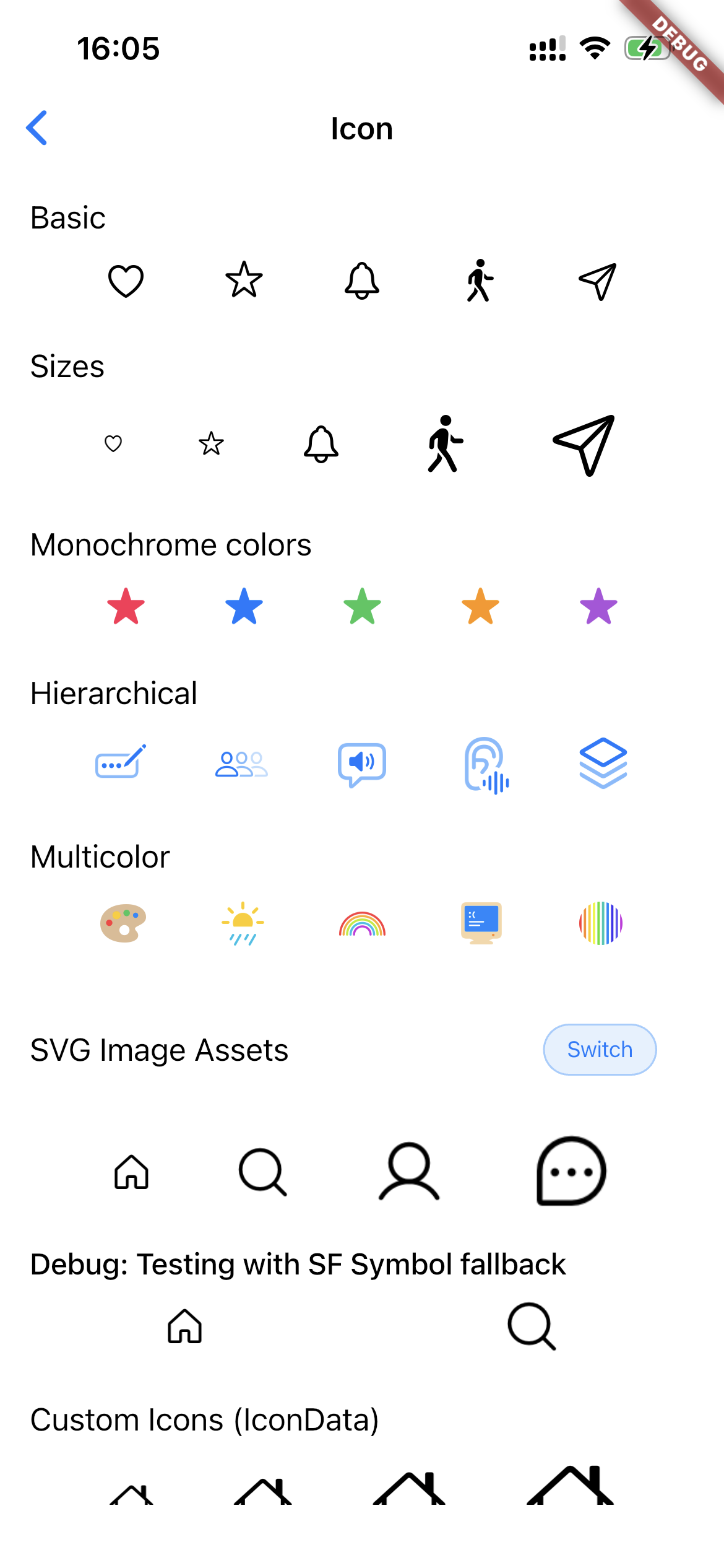
- Multiple Icon Types: The
CNIconvalue type covers SF Symbols, xcassets, Flutter asset paths, and raw bytes (SVG/PNG/JPG). TheCNIconViewwidget renders those sources natively on iOS/macOS (see Icon Support). - Label Typography:
TextStyle-based label styling on buttons, tab bars, segmented controls, and popup menus—font size, weight, italic, and font family are applied on native iOS/macOS, not just in Flutter fallbacks (see Label styles). - Dark Mode Support: Automatic theme synchronization with system preferences
- Glass Effect Unioning: Multiple buttons can share unified glass effects
Features #
Widgets #
| Widget | Description | Controller |
|---|---|---|
CNButton |
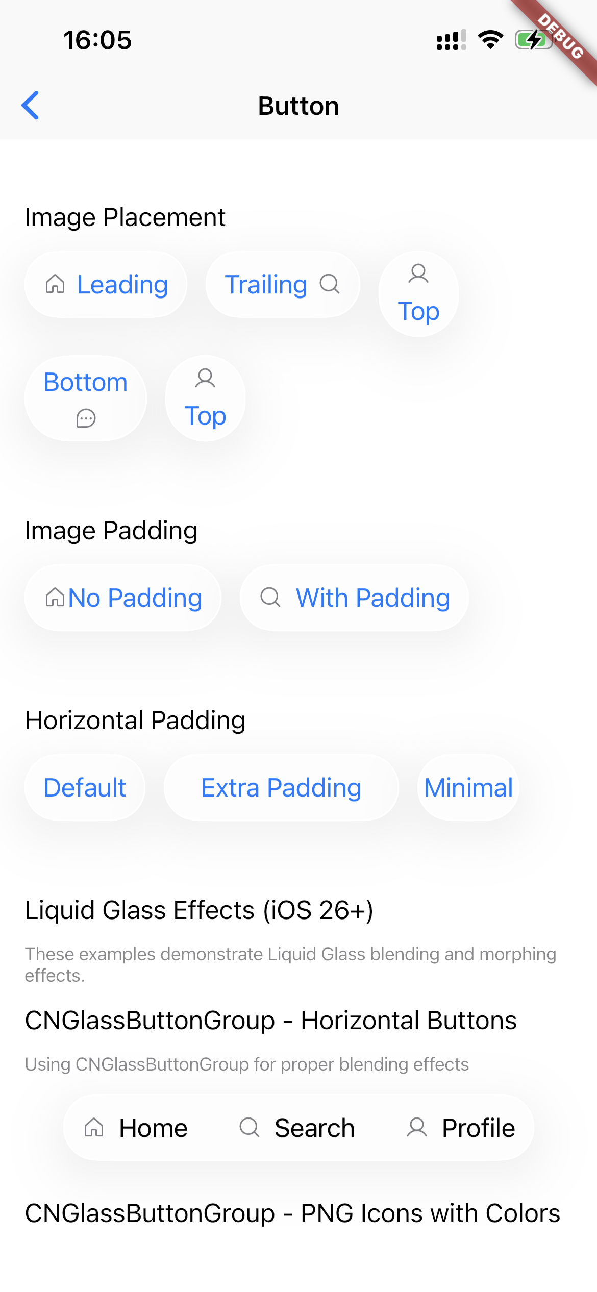
Native push button with Liquid Glass effects, SF Symbols, and image assets | - |
CNButton.icon |
Circular icon-only button variant | - |
CNIconView |
Platform-rendered SF Symbols, custom IconData, or image assets | - |
CNTabBar |
Native tab bar with split mode for scroll-aware layouts | - |
CNSlider |
Native slider with min/max range and step support | CNSliderController |
CNSwitch |
Native toggle switch with animated state changes | CNSwitchController |
CNPopupMenuButton |
Native popup menu with dividers, icons, and image assets | - |
CNPopupMenuButton.icon |
Circular icon-only popup menu variant | - |
CNSegmentedControl |
Native segmented control with SF Symbols support | - |
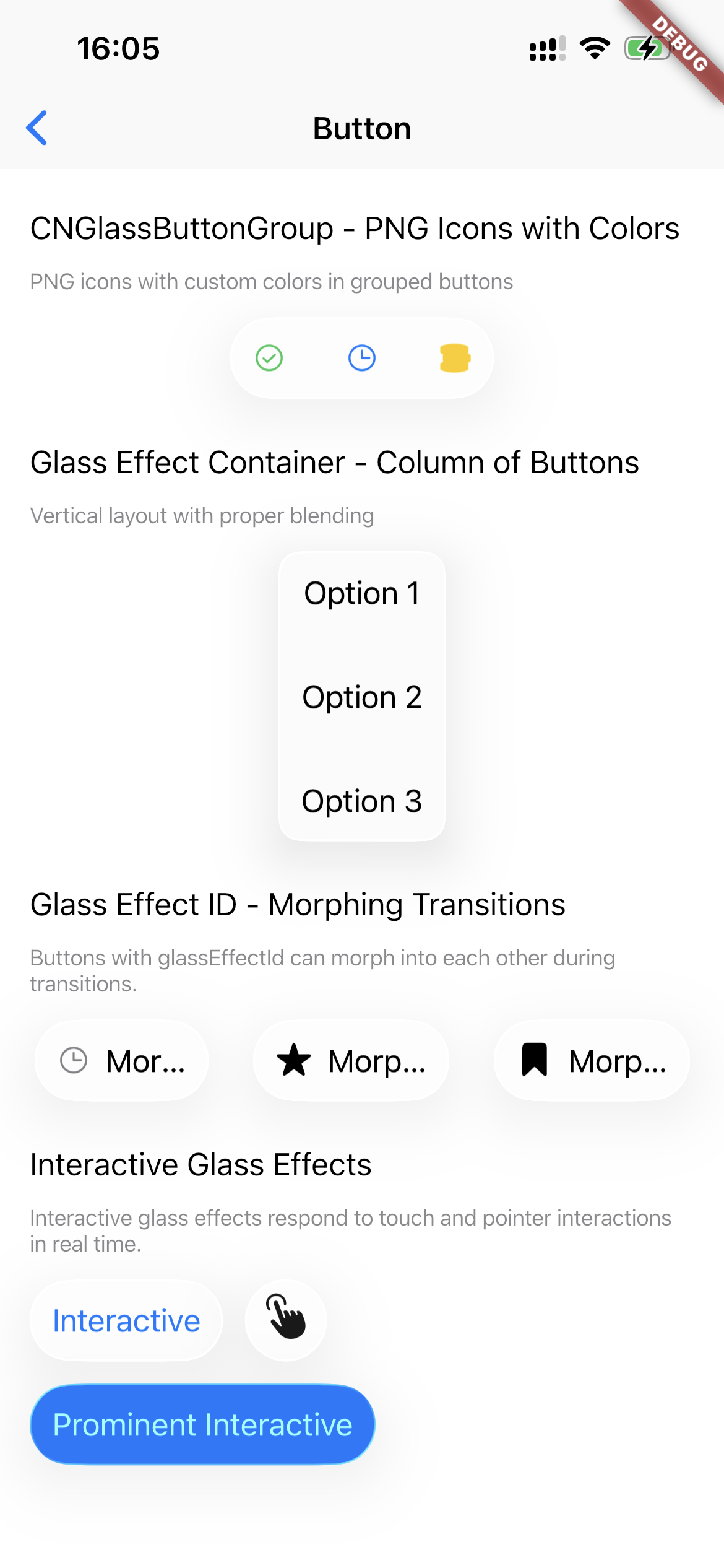
CNGlassButtonGroup |
Grouped buttons with unified glass blending | - |
LiquidGlassContainer |
Apply Liquid Glass effects to any Flutter widget | - |
CNGlassCard |
(Experimental) Pre-styled card with optional breathing glow animation | - |
CNTabBarNative |
iOS 26 Native Tab Bar with UITabBarController + search | - |
CNToast |
Toast notifications with Liquid Glass effects | - |
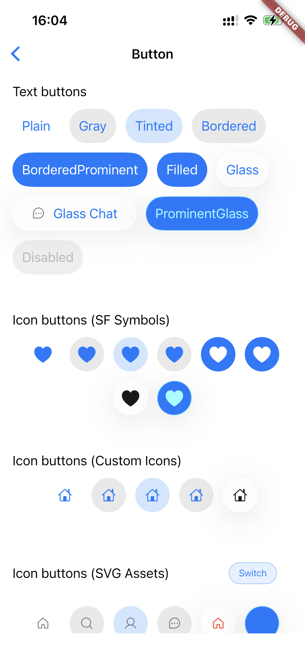
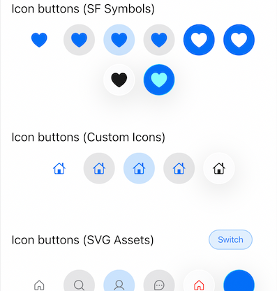
Icon Support #
CNIcon is the single immutable description of an icon (SF Symbol, catalog image, Flutter asset, or bytes). Pass it to APIs such as CNButton.icon, CNTabBarItem.icon, or CNPopupMenuButton image fields.
CNIconView is the widget that draws a CNSymbol, CNIcon, or IconData using native views when available. Do not confuse it with the CNIcon type.
| Constructor | Source |
|---|---|
CNIcon.symbol('name') |
SF Symbol (system icon) |
CNIcon.xcasset('name') |
App asset catalog (xcassets) |
CNIcon.asset('path') |
Flutter asset path (SVG/PNG/JPG auto-detected) |
CNIcon.svg(bytes) |
SVG bytes |
CNIcon.png(bytes) |
PNG bytes |
CNIcon.jpg(bytes) |
JPG bytes |
// SF Symbol
CNButton(
  label: 'Settings',
  icon: const CNIcon.symbol('gear', size: Size(20, 20)),
  onPressed: () {},
)

// Flutter asset (SVG/PNG/JPG — format auto-detected from extension)
CNButton(
  label: 'Custom',
  icon: const CNIcon.asset('assets/icons/custom.png', size: Size(20, 20)),
  onPressed: () {},
)

// App asset catalog (xcassets)
CNButton(
  label: 'Logo',
  icon: const CNIcon.xcasset('AppIcon', size: Size(20, 20)),
  onPressed: () {},
)

// Tinted icon
CNButton.icon(
  icon: const CNIcon.symbol('house.fill', size: Size(20, 20)),
  tint: Colors.blue,
  onPressed: () {},
)

// Native icon widget (SF Symbol or imageAsset: CNIcon.asset(...))
CNIconView(
  symbol: const CNSymbol('star.fill', size: 24),
)
Button Styles #
CNButtonStyle.plain           // Minimal, text-only
CNButtonStyle.gray            // Subtle gray background
CNButtonStyle.tinted          // Tinted text
CNButtonStyle.bordered        // Bordered outline
CNButtonStyle.borderedProminent // Accent-colored border
CNButtonStyle.filled          // Solid filled background
CNButtonStyle.glass           // Liquid Glass effect (iOS 26+)
CNButtonStyle.prominentGlass  // Prominent glass effect (iOS 26+)
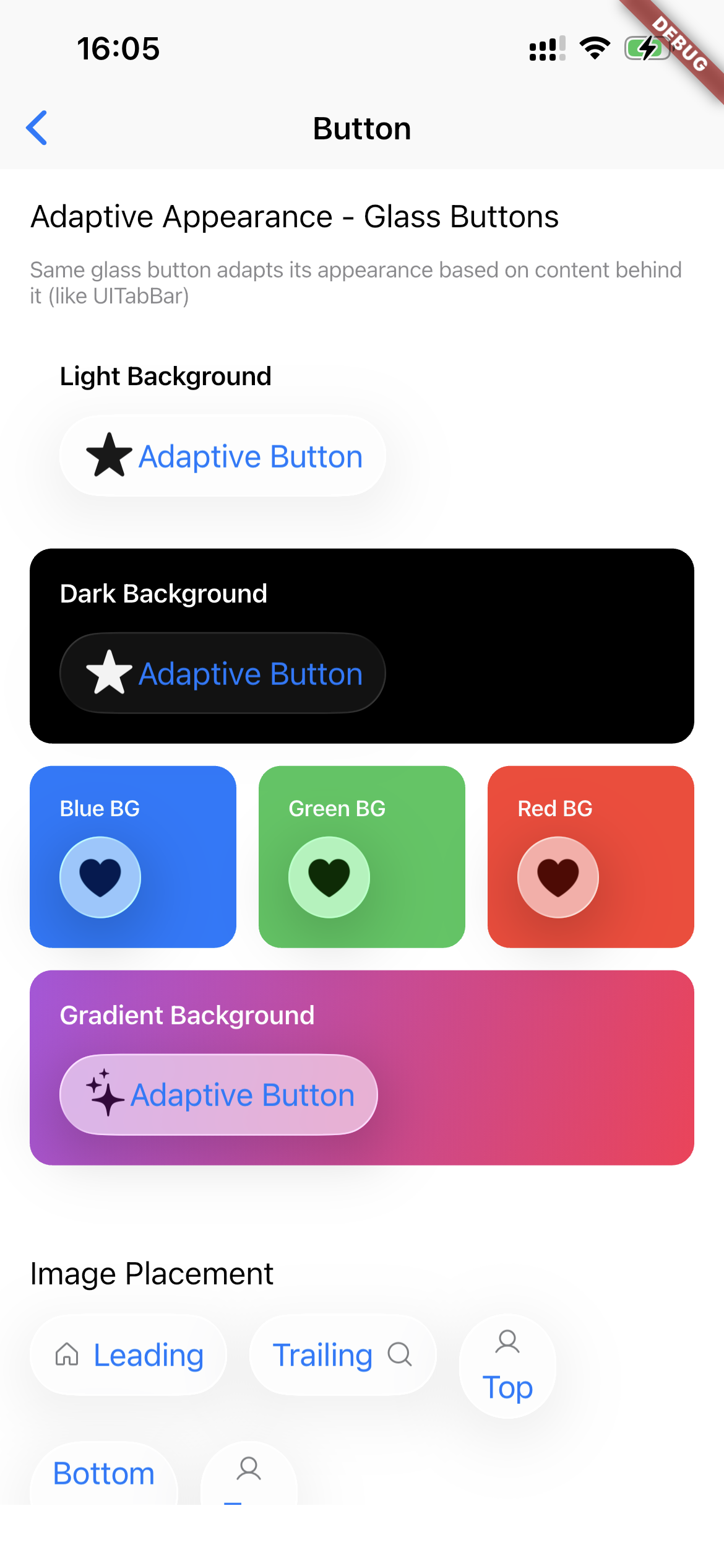
Label styles #
Several widgets accept TextStyle so you can match your app’s typography on the native layer. The following fields are encoded to iOS/macOS: fontSize, fontWeight (maps to CSS-style 100–900), fontStyle: FontStyle.italic, and fontFamily.
Label color on native controls uses the widget’s theme or tint APIs (for example CNButtonTheme.labelColor, CNButtonTheme.tint, tab bar tint, or segment tint)—not the TextStyle.color field in the channel payload. You can still set color on TextStyle for Flutter fallback paths; for consistent native appearance, set labelColor / tint on CNButtonTheme (or the relevant widget) alongside labelStyle.
| API | Where to set |
|---|---|
CNButtonTheme.labelStyle |
CNButton, CNButton.icon (theme:), and CNButtonData / CNGlassButtonGroup via each button’s theme |
CNTabBar.labelStyle / activeLabelStyle |
Normal vs selected tab item titles |
CNSegmentedControl.labelStyle / activeLabelStyle |
Unselected vs selected segment titles |
CNPopupMenuButton.labelStyle |
Primary button label (and styling hooks for the native menu where supported) |
CNButton(
  label: 'Continue',
  theme: CNButtonTheme(
    tint: CupertinoColors.activeBlue,
    labelStyle: TextStyle(
      fontSize: 17,
      fontWeight: FontWeight.w600,
      fontFamily: '.SF Pro Text',
    ),
  ),
  onPressed: () {},
)

CNTabBar(
  labelStyle: const TextStyle(fontSize: 10, fontWeight: FontWeight.w500),
  activeLabelStyle: const TextStyle(
    fontSize: 10,
    fontWeight: FontWeight.w600,
  ),
  items: const [
    CNTabBarItem(
      label: 'Home',
      icon: CNIcon.symbol('house.fill'),
    ),
  ],
  currentIndex: 0,
  onTap: (_) {},
)
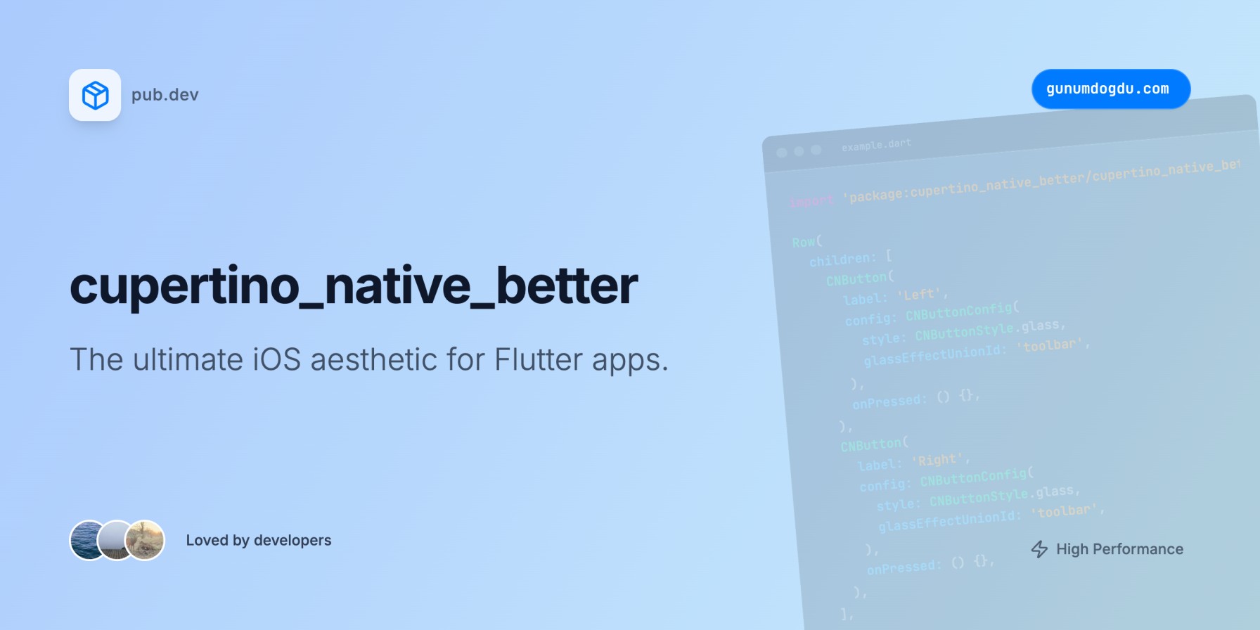
Glass Effect Unioning #
Multiple buttons can share a unified glass effect:
Row(
  children: [
    CNButton(
      label: 'Left',
      config: CNButtonConfig(
        style: CNButtonStyle.glass,
        glassEffectUnionId: 'toolbar',
      ),
      onPressed: () {},
    ),
    CNButton(
      label: 'Right',
      config: CNButtonConfig(
        style: CNButtonStyle.glass,
        glassEffectUnionId: 'toolbar',
      ),
      onPressed: () {},
    ),
  ],
)
Tab Bar with Split Mode #
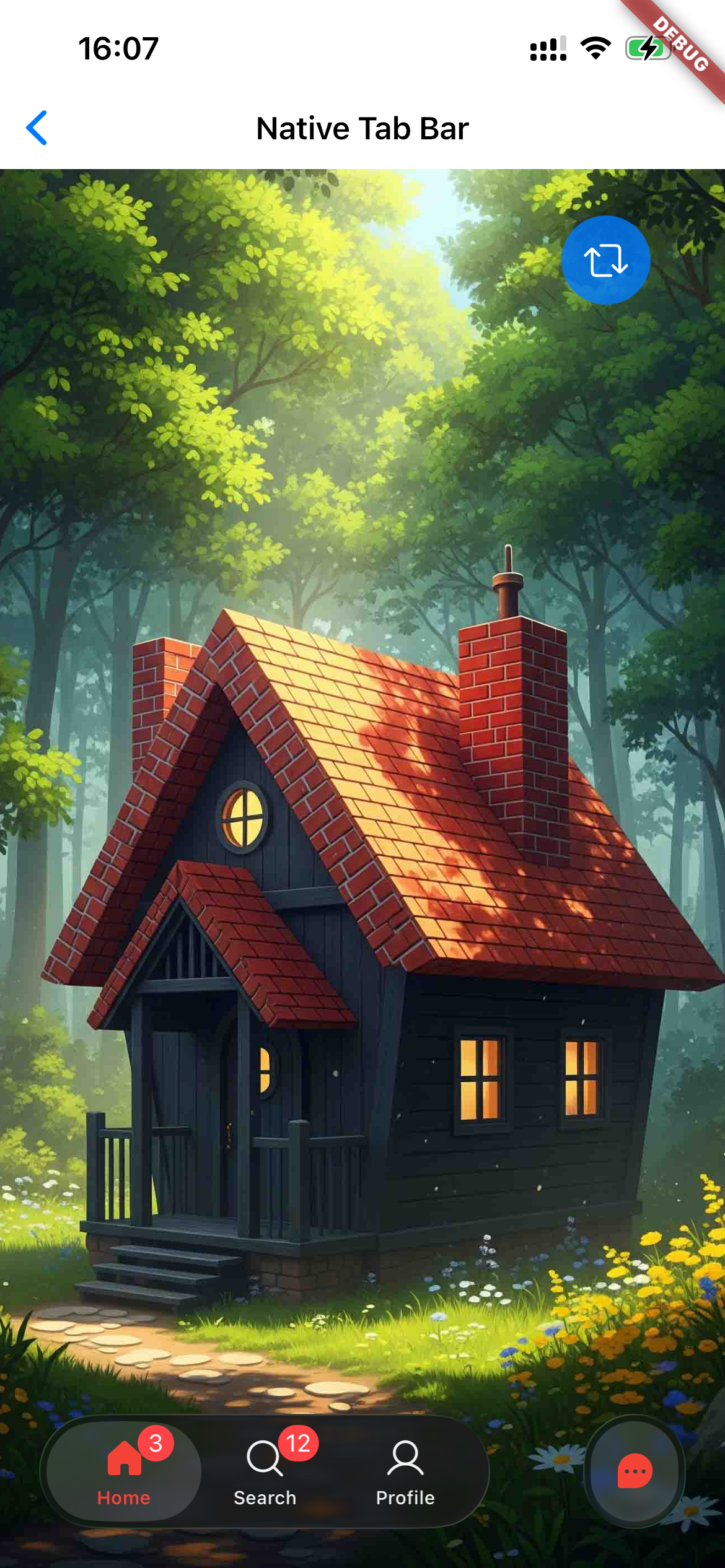
CNTabBar(
  items: [
    CNTabBarItem(
      label: 'Home',
      icon: const CNIcon.symbol('house'),
      activeIcon: const CNIcon.symbol('house.fill'),
    ),
    CNTabBarItem(
      label: 'Profile',
      icon: const CNIcon.symbol('person.crop.circle'),
      activeIcon: const CNIcon.symbol('person.crop.circle.fill'),
    ),
  ],
  currentIndex: _selectedIndex,
  onTap: (index) => setState(() => _selectedIndex = index),
  split: true, // Separates tabs when scrolling
  rightCount: 1, // Number of tabs pinned to the right
)
Native iOS 26 Tab Bar (CNTabBarNative) #
For full iOS 26 liquid glass tab bar experience with native UITabBarController:
@override
void initState() {
  super.initState();
  CNTabBarNative.enable(
    tabs: [
      CNTab(title: 'Home', sfSymbol: const CNIcon.symbol('house.fill')),
      CNTab(title: 'Search', sfSymbol: const CNIcon.symbol('magnifyingglass'), isSearchTab: true),
      CNTab(title: 'Profile', sfSymbol: const CNIcon.symbol('person.fill')),
    ],
    onTabSelected: (index) => setState(() => _selectedTab = index),
    onSearchChanged: (query) => filterResults(query),
  );
}

@override
void dispose() {
  CNTabBarNative.disable();
  super.dispose();
}
Tab Bar with iOS 26 Search Tab #
The CNTabBar supports iOS 26's native search tab feature with animated expansion:
CNTabBar(
  items: [
    CNTabBarItem(
      label: 'Overview',
      icon: const CNIcon.symbol('square.grid.2x2.fill'),
    ),
    CNTabBarItem(
      label: 'Projects',
      icon: const CNIcon.symbol('folder'),
      activeIcon: const CNIcon.symbol('folder.fill'),
    ),
  ],
  currentIndex: _index,
  onTap: (i) => setState(() => _index = i),
  // iOS 26 Search Tab Feature
  searchItem: CNTabBarSearchItem(
    placeholder: 'Find customer',
    // Control keyboard auto-activation
    automaticallyActivatesSearch: false, // Keyboard only opens on text field tap
    onSearchChanged: (query) {
      // Live filtering as user types
    },
    onSearchSubmit: (query) {
      // Handle search submission
    },
    onSearchActiveChanged: (isActive) {
      // React to search expand/collapse
    },
    style: const CNTabBarSearchStyle(
      iconSize: 20,
      buttonSize: 44,
      searchBarHeight: 44,
      animationDuration: Duration(milliseconds: 400),
      showClearButton: true,
    ),
  ),
  searchController: _searchController, // Optional programmatic control
)
automaticallyActivatesSearch
Controls whether the keyboard opens automatically when the search tab expands:
true(default): Tapping the search button expands the bar AND opens the keyboardfalse: Tapping the search button only expands the bar; keyboard opens when user taps the text field
This mirrors UISearchTab.automaticallyActivatesSearch from UIKit.
Installation #
Add to your pubspec.yaml:
dependencies:
  cupertino_native_plus: ^0.0.7
Usage #
Basic Button #
CNButton(
  label: 'Get Started',
  icon: const CNIcon.symbol('arrow.right', size: Size(18, 18)),
  config: const CNButtonConfig(
    style: CNButtonStyle.filled,
    imagePlacement: CNImagePlacement.trailing,
  ),
  onPressed: () {
    // Handle tap
  },
)
Button Styles Gallery #
Icon-Only Button #
CNButton.icon(
  icon: const CNIcon.symbol('plus', size: Size(24, 24)),
  config: const CNButtonConfig(style: CNButtonStyle.glass),
  onPressed: () {},
)
Native Icons #
CNIconView(
  symbol: const CNSymbol(
    'star.fill',
    size: 32,
    color: Colors.amber,
    mode: CNSymbolRenderingMode.multicolor,
  ),
)
Slider with Controller #
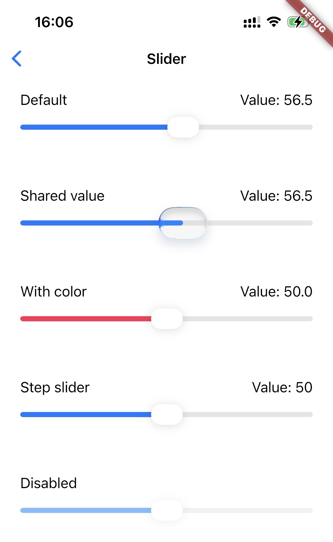
final controller = CNSliderController();

CNSlider(
  value: 0.5,
  min: 0,
  max: 1,
  controller: controller,
  onChanged: (value) {
    print('Value: $value');
  },
)

// Programmatic update
controller.setValue(0.75);
Switch with Controller #
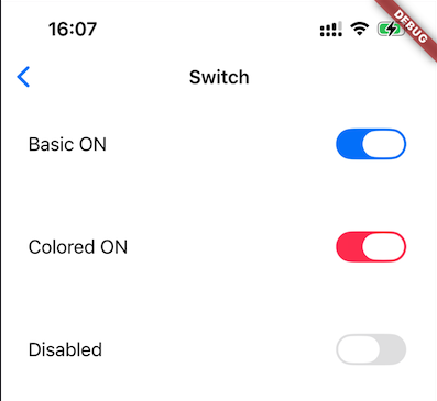
final controller = CNSwitchController();

CNSwitch(
  value: _isEnabled,
  onChanged: (value) {
    setState(() => _isEnabled = value);
  },
  controller: controller,
  color: Colors.green, // Optional tint color
)

// Programmatic control
controller.setValue(true, animated: true);
controller.setEnabled(false); // Disable interaction
Popup Menu Button #
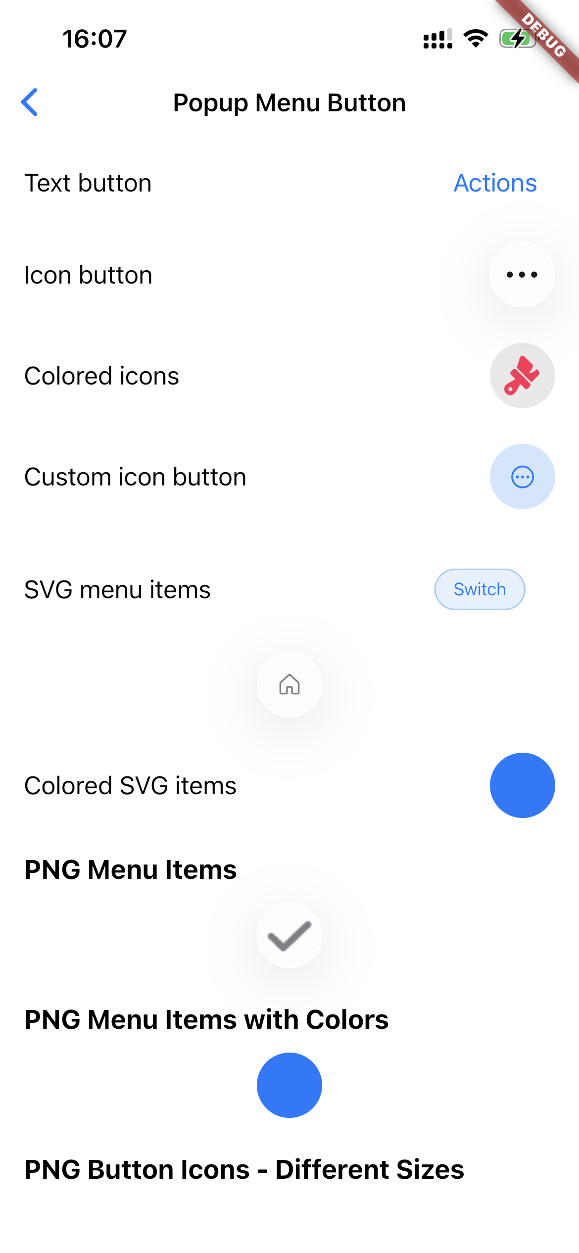
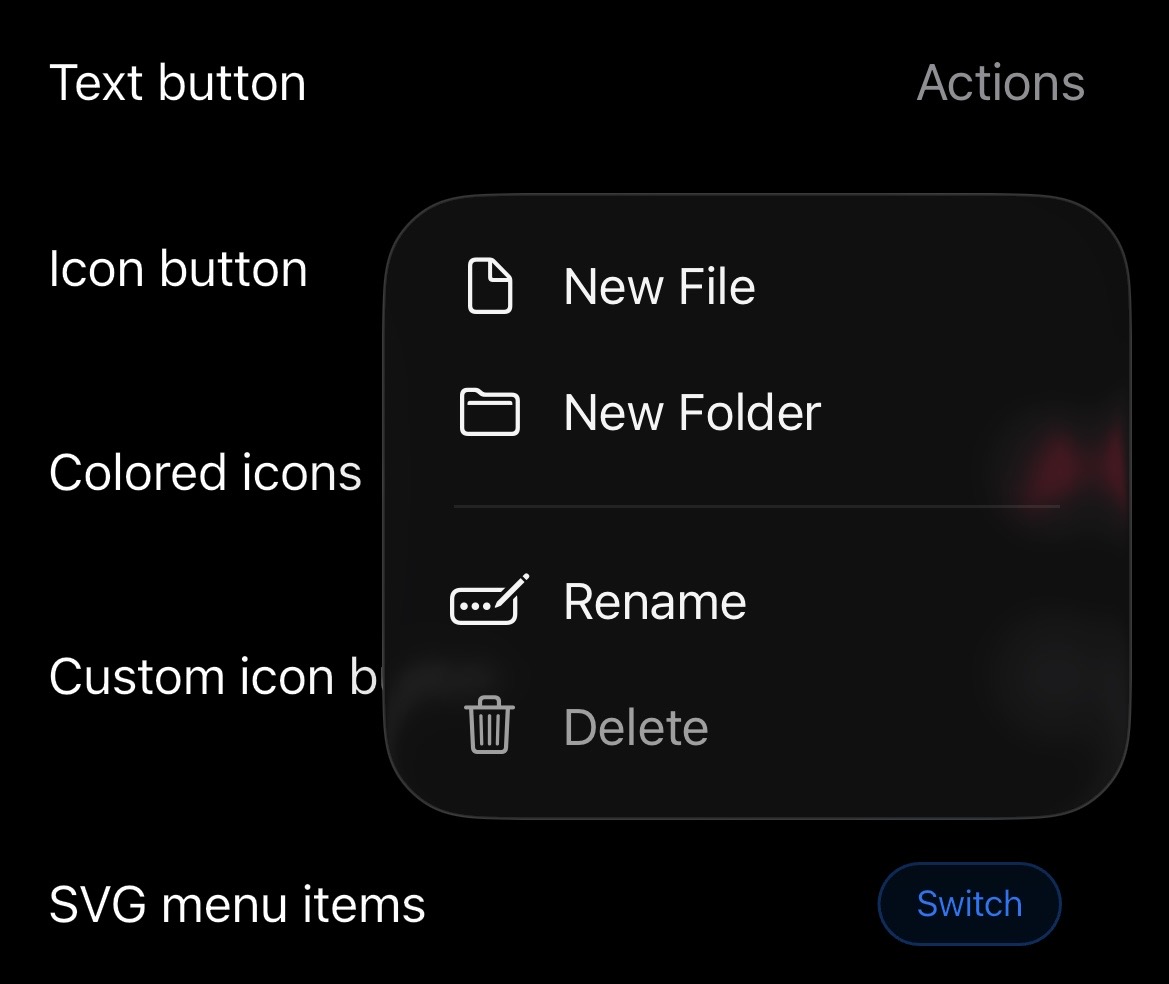
// Text-labeled popup menu
CNPopupMenuButton(
  buttonLabel: 'Options',
  buttonStyle: CNButtonStyle.glass,
  items: [
    CNPopupMenuItem(
      label: 'Edit',
      icon: const CNIcon.symbol('pencil'),
    ),
    CNPopupMenuItem(
      label: 'Share',
      icon: const CNIcon.symbol('square.and.arrow.up'),
    ),
    const CNPopupMenuDivider(), // Visual separator
    CNPopupMenuItem(
      label: 'Delete',
      icon: const CNIcon.symbol('trash', color: Colors.red),
      enabled: true,
    ),
  ],
  onSelected: (index) {
    print('Selected item at index: $index');
  },
)

// Icon-only popup menu (circular glass button)
CNPopupMenuButton.icon(
  buttonIcon: const CNIcon.symbol('ellipsis.circle', size: Size(24, 24)),
  buttonStyle: CNButtonStyle.glass,
  items: [
    CNPopupMenuItem(label: 'Option 1', icon: const CNIcon.symbol('star')),
    CNPopupMenuItem(label: 'Option 2', icon: const CNIcon.symbol('heart')),
  ],
  onSelected: (index) {},
)
Segmented Control #
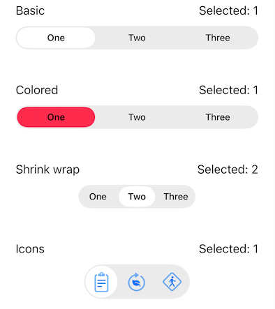
// Text-only segments
CNSegmentedControl(
  labels: ['Day', 'Week', 'Month', 'Year'],
  selectedIndex: _selectedIndex,
  onValueChanged: (index) {
    setState(() => _selectedIndex = index);
  },
  color: Colors.blue, // Optional tint color
)

// Segments with SF Symbols
CNSegmentedControl(
  labels: ['List', 'Grid', 'Gallery'],
  sfSymbols: [
    const CNIcon.symbol('list.bullet'),
    const CNIcon.symbol('square.grid.2x2'),
    const CNIcon.symbol('photo.on.rectangle'),
  ],
  selectedIndex: _viewMode,
  onValueChanged: (index) {
    setState(() => _viewMode = index);
  },
  shrinkWrap: true, // Size to content
)
Liquid Glass Container #
LiquidGlassContainer(
  config: LiquidGlassConfig(
    effect: CNGlassEffect.regular,
    shape: CNGlassEffectShape.rect,
    cornerRadius: 16,
    interactive: true,
  ),
  child: Padding(
    padding: EdgeInsets.all(16),
    child: Text('Glass Effect'),
  ),
)

// Or use the extension
Text('Glass Effect')
  .liquidGlass(cornerRadius: 16)
Experimental: Glass Card #
CNGlassCard(
  child: Text("Hello"),
  breathing: true, // Optional subtle glow animation
)
Platform Fallbacks #
| Platform | Liquid Glass | SF Symbols | Other Widgets |
|---|---|---|---|
| iOS 26+ | Native | Native | Native |
| iOS 13-25 | CupertinoButton | Native via CNIconView | CupertinoWidgets |
| macOS 26+ | Native | Native | Native |
| macOS 11-25 | CupertinoButton | Native via CNIconView | CupertinoWidgets |
| Android/Web/etc | Material fallback | Flutter Icon | Material fallback |
Version Detection #
Check platform capabilities:
// Check if Liquid Glass is available
if (PlatformVersion.shouldUseNativeGlass) {
  // iOS 26+ or macOS 26+
}

// Check if SF Symbols are available (iOS 13+, macOS 11+)
if (PlatformVersion.supportsSFSymbols) {
  // Use CNIconView for native rendering
}

// Get specific version
print('iOS version: ${PlatformVersion.iosVersion}');
print('macOS version: ${PlatformVersion.macOSVersion}');
Requirements #
- Flutter: >= 3.3.0
- Dart SDK: >= 3.9.0
- iOS: >= 13.0 (Liquid Glass requires iOS 26+)
- macOS: >= 11.0 (Liquid Glass requires macOS 26+)
Migration from Previous Versions #
Version 0.0.7 introduces breaking changes to the icon/image API. See MIGRATION.md for the full guide.
Quick Reference #
| Before | After |
|---|---|
CNSymbol('house', size: 20) |
CNIcon.symbol('house', size: Size(20, 20)) |
CNIcon('path', size: 20) (old positional / asset) |
CNIcon.asset('path', size: Size(20, 20)) |
CNImageAsset / CNImageAsset.symbol(...) |
CNIcon / CNIcon.symbol(...) |
CNIcon(...) widget (native SF Symbol view) |
CNIconView(...) |
customIcon: CupertinoIcons.home |
icon: CNIcon.symbol('house.fill'), tint: color |
CNButtonData(icon: CNSymbol(...)) |
CNButtonData(icon: CNIcon.symbol(...)) |
CNButtonDataConfig(glassMaterial: ...) |
CNButtonData(theme: CNButtonTheme(glassMaterial: ...)) |
dependencies:
  cupertino_native_plus: ^0.0.7
Contributing #
Contributions are welcome! Please feel free to submit a Pull Request.
- Fork the repository
- Create your feature branch (
git checkout -b feature/amazing-feature) - Commit your changes (
git commit -m 'Add amazing feature') - Push to the branch (
git push origin feature/amazing-feature) - Open a Pull Request
Credits #
This package is inspired by:
- cupertino_native by Serverpod
Special thanks to gunumdogdu for the improvements and fixes contributed through cupertino_native_better, including enhanced version detection, improved icon support, and various bug fixes.
License #
MIT License - see LICENSE for details.
Metadata
Documentation
Publisher
Weekly Downloads
Metadata
Native Liquid Glass widgets for iOS and macOS with pixel-perfect fidelity.
Repository (GitHub)
View/report issues
Topics
#ios #macos #cupertino #liquid-glass #native-widgets
License
 MIT (license)
Dependencies
equatable, flutter, plugin_platform_interface
More
Packages that depend on cupertino_native_plus
Packages that implement cupertino_native_plus