info_label 2.0.1  info_label: ^2.0.1 copied to clipboard
Published 9 days ago •  jhonacode.com
jhonacode.cominfo_label is a Flutter library that provides customizable components for displaying information.
Info Label #

A high-performance Flutter label widget built on CustomPainter. Background, border, text, and overlay indicators are painted directly on canvas for minimal widget overhead.
Features #
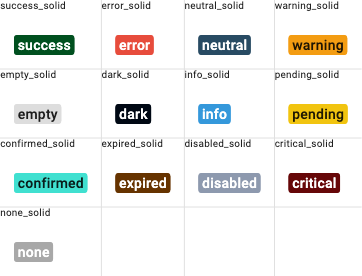
- 13 label types with auto-contrast text color
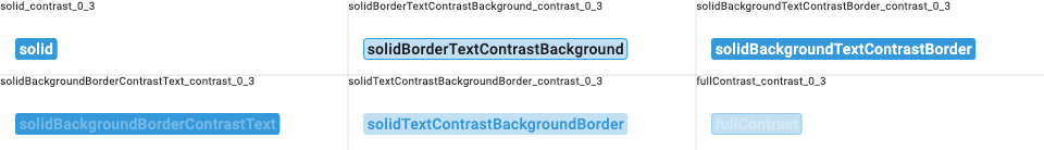
- 6 color distribution modes (solid, contrast combinations, full contrast)
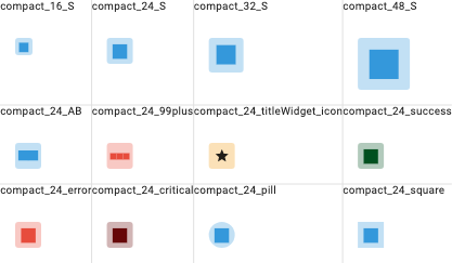
- Compact mode — fixed-size square with auto-scaled centered text
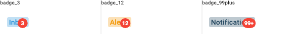
- Overlay indicator — dot, badge, text-only, or bordered badge (all painted, zero widgets)
- iOS smooth corners — squircle/superellipse via cubic bezier curves
- Hover support — paint-only repaint via
ValueNotifier(no widget rebuild) - Composable — compact, overlay, and hover can be combined freely
Getting Started #
dependencies:
  info_label: ^2.0.1
import 'package:info_label/info_label.dart';
Usage #
Basic label #
InfoLabel(
  text: "Success",
  typeInfoLabel: TypeInfoLabel.success,
)
With icons #
InfoLabel(
  text: "Warning",
  typeInfoLabel: TypeInfoLabel.warning,
  leftIcon: Icon(Icons.warning, size: 16),
  rightIcon: Icon(Icons.arrow_forward, size: 16),
)
Color distribution #
InfoLabel(
  text: "Outlined style",
  typeInfoLabel: TypeInfoLabel.info,
  typeColor: TypeDistributionColor.solidBorderTextContrastBackground,
  contrastLevel: 0.2,
)
Compact mode (badge/avatar) #
// Single letter — full CustomPainter, 1 RenderObject
InfoLabel(
  text: "S",
  typeInfoLabel: TypeInfoLabel.info,
  compactSize: 24,
)

// Number
InfoLabel(
  text: "99+",
  typeInfoLabel: TypeInfoLabel.error,
  compactSize: 32,
)
Overlay indicator #
// Dot
InfoLabel(
  text: "Messages",
  typeInfoLabel: TypeInfoLabel.info,
  overlayColor: Colors.red,
  overlaySize: 8,
)

// Badge with number
InfoLabel(
  text: "Inbox",
  typeInfoLabel: TypeInfoLabel.info,
  overlayColor: Colors.red,
  overlaySize: 20,
  overlayText: "3",
)

// Text only (no background)
InfoLabel(
  text: "Tasks",
  typeInfoLabel: TypeInfoLabel.neutral,
  overlayText: "5",
  overlayTextColor: Colors.red,
  overlaySize: 16,
)

// Bordered badge
InfoLabel(
  text: "Chat",
  typeInfoLabel: TypeInfoLabel.info,
  overlayColor: Colors.white,
  overlayBorderColor: Colors.red,
  overlayText: "3",
  overlayTextColor: Colors.red,
  overlaySize: 20,
)
iOS smooth corners #
InfoLabel(
  text: "Smooth",
  typeInfoLabel: TypeInfoLabel.info,
  roundedCorners: 12,
  smoothCorners: true,
)
Hover support #
InfoLabel(
  text: "Hover me",
  typeInfoLabel: TypeInfoLabel.info,
  activeOnHover: true,
  onHoverColor: Colors.blue.withOpacity(0.2),
)
Combining features #
// Compact + overlay + hover
InfoLabel(
  text: "S",
  compactSize: 24,
  typeInfoLabel: TypeInfoLabel.info,
  overlayColor: Colors.red,
  overlaySize: 10,
  overlayText: "3",
  activeOnHover: true,
  smoothCorners: true,
  roundedCorners: 8,
)
Custom colors #
InfoLabel(
  text: "Custom",
  textColor: Colors.white,
  backgroundColor: Colors.indigo,
  borderColor: Colors.indigoAccent,
)

// Global color override
InfoLabel(
  text: "Global",
  globalColor: Colors.teal,
  contrastLevel: 0.3,
)
Message widget #
InfoLabel(
  text: "Title",
  typeInfoLabel: TypeInfoLabel.neutral,
  msg: Text("Additional description below"),
)
Golden Tests #
Type Colors (solid) #
Color Distribution (contrast 0.3) #
Compact Mode #
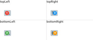
Overlay Badges #
Overlay Positions #
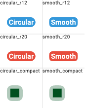
Corner Comparison (circular vs smooth) #
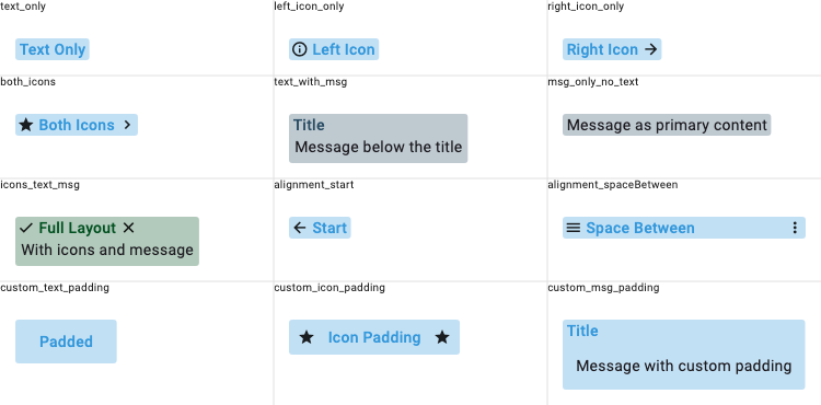
Layout & Icons #
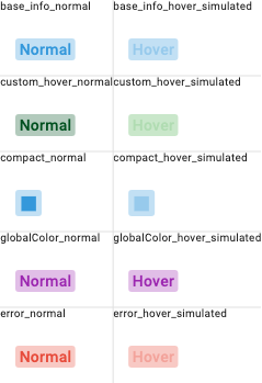
Hover States #
Migration from 1.x #
Breaking changes #
| 1.x | 2.0 |
|---|---|
activeOnHover: true (bool) |
Same API, same behavior (now uses paint-only repaint) |
Widget? overlay + Stack |
overlayColor + overlayText + overlayBorderColor (painted) |
InfoLabelType enum |
Removed. Use composable flags: compactSize, activeOnHover, overlayColor |
DecoratedBox rendering |
CustomPainter rendering (visual output identical) |
New parameters #
| Parameter | Type | Default | Description |
|---|---|---|---|
compactSize |
double? |
null |
Fixed size for compact square label |
smoothCorners |
bool |
false |
iOS-style squircle corners |
overlayColor |
Color? |
null |
Overlay circle fill color |
overlayBorderColor |
Color? |
null |
Overlay circle border color |
overlaySize |
double |
8.0 |
Overlay circle diameter |
overlayText |
String? |
null |
Text/number inside overlay |
overlayTextColor |
Color? |
null |
Overlay text color |
overlayTop |
double? |
-2.0 |
Overlay position from top |
overlayRight |
double? |
-2.0 |
Overlay position from right |
overlayBottom |
double? |
null |
Overlay position from bottom |
overlayLeft |
double? |
null |
Overlay position from left |
Documentation #
Contributing #
Contributions are welcome! Open an issue or submit a pull request on GitHub.
Metadata
3
likes
160
points
380
downloads
Documentation
Publisher
Weekly Downloads
Metadata
info_label is a Flutter library that provides customizable components for displaying information.
Repository (GitHub)
View/report issues
License
 MIT (license)