kalender 0.16.0  kalender: ^0.16.0 copied to clipboard
 kdab.com
This Flutter package offers a Calendar Widget featuring Day, MultiDay, Month and Schedule views. Moreover, it empowers you to tailor the visual aspects of the calendar widget.


Kalender #
A highly customizable Flutter calendar widget with Day, MultiDay, Month, and Schedule views — featuring drag-and-drop rescheduling, event resizing, timezone support, and full control over appearance and behavior.
Warning
This package is still in development — API changes may occur before version 1.0.0.
Table of Contents #
- Features
- Preview
- Installation
- Quick Start
- Custom Events
- Views
- Controllers
- Tile Components
- Callbacks
- Configuration & Interaction
- Appearance / Custom Components
- Event Layout
- Locale
- Location
- Contributing
- License
Features #
- Views: Day, Multi-day, Month and Schedule. find out more
- Extensible events: Attach custom data (title, color, etc.) by subclassing
CalendarEvent. find out more - Tile components: Fully customize event tiles — stationary, dragging, feedback, and resize handles. find out more
- Reschedule: Drag and drop events between days and times.
- Resize: Resize events on desktop and mobile.
- Controllers: Manage your calendar with dedicated controllers. find out more
- Callbacks: React to taps, long presses, event creation and changes. find out more
- Configuration: Fine-grained control over interaction, snapping, scroll physics, and layout. find out more
- Appearance: Style default components or supply custom builders. find out more
- Event layout: Built-in strategies or bring your own. find out more
- Locale: Localize day/month names via the intl package. find out more
- Location: Timezone-aware display via the timezone package. find out more
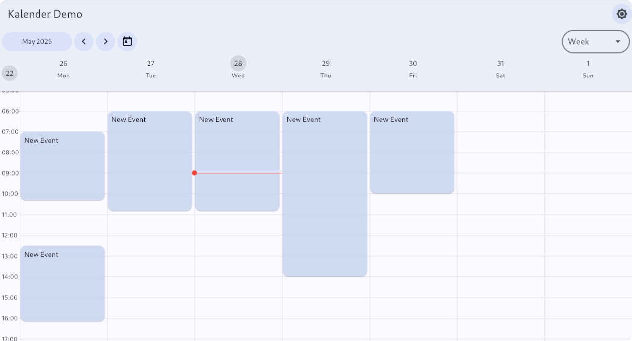
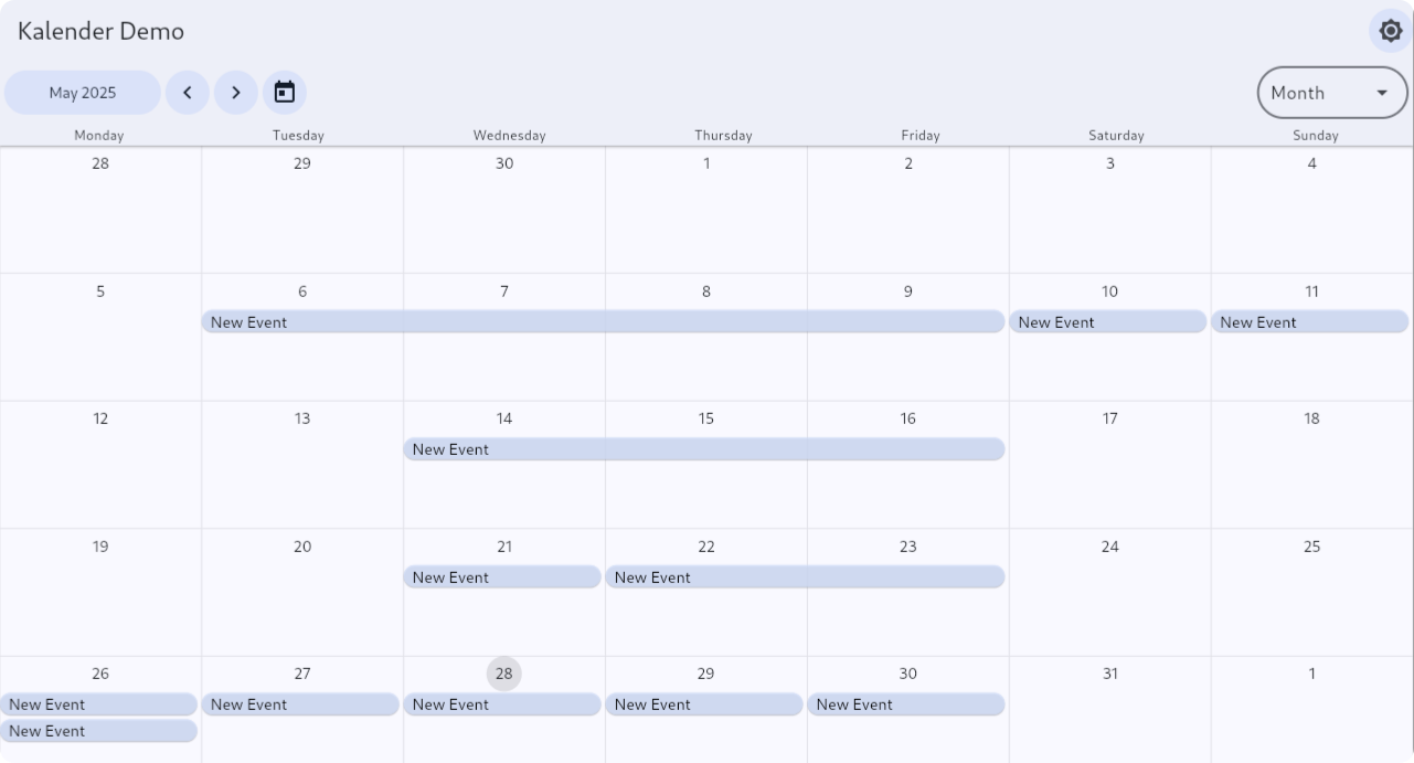
Preview #
| MultiDay (week) | Month | Schedule |
|---|---|---|
 |
 |
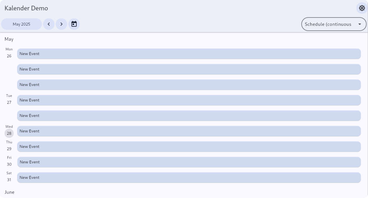 |
See all views — desktop & mobile, light & dark — in the Live Demo.
Installation #
Requirements #
| Requirement | Version |
|---|---|
| Dart SDK | >=3.0.0 <4.0.0 |
| Flutter | >=3.22.0 |
Dependencies #
flutter pub add kalender
If you plan to use location/timezones support, also add:
flutter pub add timezone
If you plan to use locale support, also add:
flutter pub add intl
Quick Start #
The minimal setup — using only the base CalendarEvent class with no custom fields:
import 'package:flutter/material.dart';
import 'package:kalender/kalender.dart';

void main() {
  runApp(const MyApp());
}

class MyApp extends StatelessWidget {
  const MyApp({super.key});

  @override
  Widget build(BuildContext context) {
    return MaterialApp(
      home: Scaffold(body: MyCalendar()),
    );
  }
}

class MyCalendar extends StatefulWidget {
  const MyCalendar({super.key});

  @override
  State<MyCalendar> createState() => _MyCalendarState();
}

class _MyCalendarState extends State<MyCalendar> {
  final eventsController = DefaultEventsController();
  final calendarController = CalendarController();

  @override
  Widget build(BuildContext context) {
    return CalendarView(
      eventsController: eventsController,
      calendarController: calendarController,
      viewConfiguration: MultiDayViewConfiguration.singleDay(),
      callbacks: CalendarCallbacks(
        onEventCreated: (event) => eventsController.addEvent(event),
      ),
      header: CalendarHeader(),
      body: CalendarBody(),
    );
  }
}
For a real app you almost always want custom fields on your events. See Custom Events below.
Custom Events #
Since v0.16.0, CalendarEvent is no longer generic. The idiomatic way to attach custom data (title, color, description, etc.) is to extend CalendarEvent directly.
class Event extends CalendarEvent {
  final String title;
  final String? description;
  final Color? color;

  Event({
    required super.dateTimeRange,
    required this.title,
    this.description,
    this.color,
    super.interaction,
  });

  @override
  Event copyWith({
    DateTimeRange? dateTimeRange,
    EventInteraction? interaction,
    String? title,
    String? description,
    Color? color,
  }) {
    final updated = Event(
      dateTimeRange: dateTimeRange ?? this.dateTimeRange,
      interaction: interaction ?? this.interaction,
      title: title ?? this.title,
      description: description ?? this.description,
      color: color ?? this.color,
    );
    // Always carry the existing ID over to the new instance.
    updated.id = id;
    return updated;
  }

  // Override == and hashCode so that the calendar can detect when an event's
  // custom fields have changed and update the tile accordingly.
  @override
  bool operator ==(Object other) {
    if (identical(this, other)) return true;
    return super == other &&
        other is Event &&
        other.title == title &&
        other.description == description &&
        other.color == color;
  }

  @override
  int get hashCode => Object.hash(super.hashCode, title, description, color);
}
Note
If you don't override == and hashCode, the calendar cannot detect changes to your custom fields and tiles will not update when those values change (e.g. via eventsController.updateEvent(...)). Always override both whenever you add fields to your CalendarEvent subclass.
Updating events #
Use eventsController.updateEvent() to replace an existing event with an updated copy:
final original = eventsController.byId(someId)! as Event;
final updated = original.copyWith(title: 'Updated Title', color: Colors.red);
eventsController.updateEvent(event: original, updatedEvent: updated);
Because == and hashCode include your custom fields, the calendar will detect the change and rebuild the tile.
layoutEquals #
Only override layoutEquals when a custom property changes the size or position of the tile — for example, a flag that makes a tile render taller. It is not for content-only changes like color or title. The default implementation compares id, dateTimeRange, and interaction, which is sufficient for most cases.
Accessing custom fields in tile builders #
Cast the event to your subclass. A convenience getter keeps the cast to one place:
tileBuilder: (event, tileRange) {
  final myEvent = event as Event;
  return Container(
    color: myEvent.color ?? Colors.blue,
    child: Text(myEvent.title),
  );
},
Returning your subclass on event creation #
Use onEventCreate to intercept the bare CalendarEvent created by a gesture and return a fully typed instance:
callbacks: CalendarCallbacks(
  onEventCreate: (event) => Event(
    dateTimeRange: event.dateTimeRange,
    title: 'New Event',
    color: Colors.blue,
  ),
  onEventCreated: (event) => eventsController.addEvent(event),
),
Views #
Switch between views by passing a different ViewConfiguration to CalendarView. When switching, the initialDateSelectionStrategy on the view configuration determines which date becomes visible.
All configurations accept:
displayRange— the total date range the calendar can navigate within (e.g. Jan 2024 – Dec 2025). Defaults to ± 1 year from today.initialDateTime— the date to show on first render. Defaults toDateTime.now().
MultiDayViewConfiguration.week(
  displayRange: DateTimeRange(
    start: DateTime(2024, 1, 1),
    end: DateTime(2025, 12, 31),
  ),
  initialDateTime: DateTime(2024, 6, 15),
)
MultiDay View #
Displays one or more days with time on the vertical axis.
| Constructor | Description |
|---|---|
MultiDayViewConfiguration.singleDay() |
Single day |
MultiDayViewConfiguration.week() |
Full 7-day week |
MultiDayViewConfiguration.workWeek() |
Monday – Friday |
MultiDayViewConfiguration.custom(days: n) |
Custom number of days |
Month View #
Shows an entire month at a glance, weeks as rows.
| Constructor | Description |
|---|---|
MonthViewConfiguration.singleMonth() |
Single month |
Schedule View #
Presents events in a chronological scrollable list.
| Constructor | Description |
|---|---|
ScheduleViewConfiguration.continuous() |
Single continuous list |
ScheduleViewConfiguration.paginated() |
Paginated by month |
Controllers #
EventsController #
EventsController manages and exposes events to the calendar. Typically one instance per app. Use DefaultEventsController unless you need a custom storage layer.
| Method | Description |
|---|---|
addEvent(event) |
Add a single event, returns its String id |
addEvents(events) |
Add multiple events, returns List<String> of ids |
removeEvent(event) |
Remove a specific event |
removeEvents(events) |
Remove a list of events |
removeWhere(test) |
Remove events matching a predicate |
updateEvent({event, updatedEvent}) |
Replace an existing event (named parameters) |
byId(id) |
Return the event with the given String id, or null |
clearEvents() |
Remove all events |
eventsFromDateTimeRange(range) |
Events occurring during the given range (accepts optional includeMultiDayEvents, includeDayEvents, and location filters) |
CalendarController #
CalendarController drives a single CalendarView widget.
State notifiers:
| Notifier | Type | Description |
|---|---|---|
visibleDateTimeRange |
ValueNotifier<DateTimeRange> |
The currently visible date range |
visibleEvents |
ValueNotifier<Set<CalendarEvent>> |
Events visible on screen |
selectedEvent |
ValueNotifier<CalendarEvent?> |
The focused event (shows drop target / resize handles) |
Navigation methods:
jumpToPage(page)/jumpToDate(date)animateToNextPage()/animateToPreviousPage()animateToDate(date)/animateToDateTime(dateTime)animateToEvent(event)
Internally the controller delegates to a
ViewController—MultiDayViewController,MonthViewController, orScheduleViewController— depending on the activeViewConfiguration.
Tile Components #
TileComponents is the primary way to control how events look in the calendar. Pass it to CalendarHeader and/or CalendarBody for day, multi-day, and month views.
For schedule views, use ScheduleTileComponents instead (passed via CalendarBody.scheduleTileComponents).
Simple tile #
For most apps a plain tileBuilder is all you need:
CalendarBody(
  multiDayTileComponents: TileComponents(
    tileBuilder: (event, tileRange) {
      final myEvent = event as Event;
      return Container(
        decoration: BoxDecoration(
          color: myEvent.color ?? Colors.blue,
          borderRadius: BorderRadius.circular(4),
        ),
        padding: const EdgeInsets.all(4),
        child: Text(myEvent.title, style: const TextStyle(color: Colors.white)),
      );
    },
  ),
)
All TileComponents options #
Every aspect of an event tile's appearance and drag behavior can be overridden.
TileComponents reference
TileComponents(
  // Required: the stationary event tile.
  tileBuilder: (event, tileRange) => Container(),

  // Optional: shown over the calendar in portal overlays instead of tileBuilder.
  overlayTileBuilder: (event, tileRange) => Container(),

  // Optional: shown in place of the tile while it is being dragged.
  tileWhenDraggingBuilder: (event) => Container(),

  // Optional: the tile that follows the cursor / finger during a drag.
  feedbackTileBuilder: (event, dropTargetWidgetSize) => Container(),

  // Optional: rendered beneath the dragged tile to show where it will land.
  dropTargetTile: (event) => Container(),

  // The drag anchor strategy used by feedbackTileBuilder.
  dragAnchorStrategy: childDragAnchorStrategy,

  // Customize the position and size of resize handles (extend ResizeHandlePositioner).
  resizeHandlePositioner: myResizeHandlePositioner,

  // The vertical resize handle widget.
  verticalResizeHandle: Container(),

  // The horizontal resize handle widget.
  horizontalResizeHandle: Container(),
)
ScheduleTileComponents #
Schedule view tiles have a different set of builders since they are laid out in a list rather than a grid.
ScheduleTileComponents reference
ScheduleTileComponents(
  tileBuilder: (event, tileRange) => Container(),
  tileWhenDraggingBuilder: (event) => Container(),
  feedbackTileBuilder: (event, dropTargetWidgetSize) => Container(),
  dropTargetTile: (event) => Container(),
  dragAnchorStrategy: childDragAnchorStrategy,

  // Builder for days with no events.
  emptyItemBuilder: (tileRange) => Container(),

  // Builder for the month heading rows.
  monthItemBuilder: (monthRange) => Container(),
)
Advanced tiles with event-tile utilities #
For tiles that need to know the exact tapped time or find nearby events, use the provided mixins.
Tip
Disabling the calendar's built-in tap detector: The calendar only wraps event tiles in a GestureDetector when onEventTapped or onEventTappedWithDetail is provided in CalendarCallbacks. If you omit both callbacks, the wrapper is skipped and a GestureDetector inside your custom tile widget receives events unobstructed. This is the intended pattern when using DayEventTileUtils or MultiDayEventTileUtils.
DayEventTileUtils — for day / multi-day body tiles
class CustomDayEventTile extends StatelessWidget with DayEventTileUtils {
  @override
  final CalendarEvent event;

  // tileRange is InternalDateTimeRange to satisfy the mixin contract.
  @override
  final InternalDateTimeRange tileRange;

  const CustomDayEventTile({
    super.key,
    required this.event,
    required this.tileRange,
  });

  Event get myEvent => event as Event;

  @override
  Widget build(BuildContext context) {
    return GestureDetector(
      onTapUp: (details) {
        // Convert a local tap position into an exact DateTime.
        final tappedTime = dateTimeFromPosition(context, details.localPosition);
        debugPrint('Tapped at: $tappedTime');

        // Find events that overlap a ±15-minute window around this one.
        final nearby = nearbyEvents(
          context,
          before: const Duration(minutes: 15),
          after: const Duration(minutes: 15),
        );
        debugPrint('Found ${nearby.length} nearby events');
      },
      child: Container(
        decoration: BoxDecoration(
          color: myEvent.color ?? Colors.blue,
          borderRadius: BorderRadius.circular(4),
        ),
        padding: const EdgeInsets.all(4),
        child: Text(myEvent.title, style: const TextStyle(color: Colors.white)),
      ),
    );
  }

  // Static factory — pass directly to TileComponents.tileBuilder.
  static Widget builder(CalendarEvent event, DateTimeRange tileRange) =>
      CustomDayEventTile(
        event: event,
        tileRange: InternalDateTimeRange.fromDateTimeRange(tileRange),
      );
}
MultiDayEventTileUtils — for month view / multi-day header tiles
class CustomMultiDayEventTile extends StatelessWidget with MultiDayEventTileUtils {
  @override
  final CalendarEvent event;

  @override
  final InternalDateTimeRange tileRange;

  const CustomMultiDayEventTile({
    super.key,
    required this.event,
    required this.tileRange,
  });

  Event get myEvent => event as Event;

  @override
  Widget build(BuildContext context) {
    return GestureDetector(
      onTapUp: (details) {
        // Convert a horizontal tap position into a specific date.
        final tappedDate = dateFromPosition(context, details.localPosition);
        debugPrint('Tapped on: $tappedDate');

        final overlapping = nearbyEvents(context);
        debugPrint('Found ${overlapping.length} overlapping events');
      },
      child: Container(
        decoration: BoxDecoration(
          color: myEvent.color ?? Colors.green,
          borderRadius: BorderRadius.circular(4),
        ),
        padding: const EdgeInsets.symmetric(horizontal: 4, vertical: 2),
        child: Text(
          myEvent.title,
          style: const TextStyle(color: Colors.white, fontSize: 12),
          overflow: TextOverflow.ellipsis,
        ),
      ),
    );
  }

  static Widget builder(CalendarEvent event, DateTimeRange tileRange) =>
      CustomMultiDayEventTile(
        event: event,
        tileRange: InternalDateTimeRange.fromDateTimeRange(tileRange),
      );
}
Callbacks #
Pass a CalendarCallbacks to CalendarView to react to user interactions.
CalendarCallbacks(
  // --- Event interactions ---

  // Called when an event tile is tapped.
  onEventTapped: (event, renderBox) {},

  // Called when an event tile is tapped — includes tap position detail.
  onEventTappedWithDetail: (event, renderBox, detail) {},

  // Called before the calendar creates a new event from a gesture.
  // Return your concrete Event subclass here.
  onEventCreate: (event) {
    return Event(dateTimeRange: event.dateTimeRange, title: 'New Event');
  },

  // Same as onEventCreate but includes gesture detail (position, renderBox).
  onEventCreateWithDetail: (event, detail) {
    return Event(dateTimeRange: event.dateTimeRange, title: 'New Event');
  },

  // Called after a new event has been committed — add it to your controller here.
  onEventCreated: (event) => eventsController.addEvent(event),

  // Called just before a rescheduled / resized event is applied.
  onEventChange: (event) {},

  // Called after a rescheduled / resized event is applied.
  onEventChanged: (original, updated) {
    eventsController.updateEvent(event: original, updatedEvent: updated);
  },

  // --- Calendar interactions ---

  // Called when the visible page changes.
  onPageChanged: (visibleDateTimeRange) {},

  // Called when the user taps an empty area (day / week body).
  onTapped: (date) {},
  onTappedWithDetail: (detail) {
    // detail.dateTime or detail.dateTimeRange, plus renderBox & localOffset.
  },

  // Called when the user long-presses an empty area.
  onLongPressed: (date) {},
  onLongPressedWithDetail: (detail) {},

  // --- Drag-and-drop acceptance ---

  // Day / week vertical drag target. Return false to reject the drop.
  onWillAcceptWithDetailsVertical: (details, controller, configuration) => true,

  // Month / header horizontal drag target.
  onWillAcceptWithDetailsHorizontal: (details, controller, configuration) => true,
)
Configuration & Interaction #
CalendarHeader and CalendarBody accept view-specific configuration objects:
| View | Header config class | Body config class |
|---|---|---|
| MultiDay | MultiDayHeaderConfiguration |
MultiDayBodyConfiguration |
| Month | — | MonthBodyConfiguration |
| Schedule | — | ScheduleBodyConfiguration |
Both also accept:
interaction: CalendarInteraction— toggling resize / reschedule / create.snapping: CalendarSnapping— (body only, MultiDay) snap interval, snap-to-indicator, snap-to-events, custom snap strategy.
Interaction & Snapping #
CalendarBody(
  interaction: CalendarInteraction(
    allowResizing: true,
    allowRescheduling: true,
    allowEventCreation: true,
    // Tap to create (default) or long-press to create:
    createEventGesture: CreateEventGesture.tap,
  ),
  snapping: CalendarSnapping(
    snapIntervalMinutes: 15,
    snapToTimeIndicator: true,
    snapToOtherEvents: true,
    snapRange: const Duration(minutes: 5),
    eventSnapStrategy: defaultSnapStrategy,
  ),
)
Configuration details #
Each view has its own configuration class with sensible defaults. Expand the references below for the full set of options.
MultiDayHeaderConfiguration
CalendarHeader(
  multiDayHeaderConfiguration: MultiDayHeaderConfiguration(
    showTiles: true,
    tileHeight: 24,
    generateMultiDayLayoutFrame: defaultMultiDayFrameGenerator,
    maximumNumberOfVerticalEvents: null,
    eventPadding: EdgeInsets.zero,
    pageTriggerConfiguration: PageTriggerConfiguration(),
  ),
)
MultiDayBodyConfiguration
CalendarBody(
  multiDayBodyConfiguration: MultiDayBodyConfiguration(
    showMultiDayEvents: true,
    horizontalPadding: EdgeInsets.only(left: 0, right: 4),
    minimumTileHeight: 24.0,
    pageTriggerConfiguration: PageTriggerConfiguration(),
    scrollTriggerConfiguration: ScrollTriggerConfiguration(),
    eventLayoutStrategy: overlapLayoutStrategy,
    scrollPhysics: BouncingScrollPhysics(),
    pageScrollPhysics: BouncingScrollPhysics(),
  ),
)
MonthBodyConfiguration
CalendarBody(
  monthBodyConfiguration: MonthBodyConfiguration(
    tileHeight: 24,
    generateMultiDayLayoutFrame: defaultMultiDayFrameGenerator,
    pageTriggerConfiguration: PageTriggerConfiguration(),
  ),
)
ScheduleBodyConfiguration
CalendarBody(
  scheduleBodyConfiguration: ScheduleBodyConfiguration(
    emptyDay: EmptyDayBehavior.hide,
    pageTriggerConfiguration: PageTriggerConfiguration(),
    scrollTriggerConfiguration: ScrollTriggerConfiguration(),
    scrollPhysics: BouncingScrollPhysics(),
    pageScrollPhysics: BouncingScrollPhysics(),
  ),
)
Zoom #
Zoom the calendar in and out by changing the heightPerMinute value on the MultiDayViewController. The demo example shows a full implementation with CalendarZoomDetector.
Here's a minimal example of wiring up zoom with Ctrl+scroll on desktop:
class ZoomableCalendar extends StatelessWidget {
  final CalendarController calendarController;
  final Widget child;

  const ZoomableCalendar({
    super.key,
    required this.calendarController,
    required this.child,
  });

  @override
  Widget build(BuildContext context) {
    return Listener(
      onPointerSignal: (event) {
        if (!HardwareKeyboard.instance.isControlPressed) return;
        if (event is! PointerScrollEvent) return;

        final viewController = calendarController.viewController;
        if (viewController is! MultiDayViewController) return;

        final heightPerMinute = viewController.heightPerMinute;
        final delta = event.scrollDelta.dy.sign * -0.1;
        heightPerMinute.value = (heightPerMinute.value + delta).clamp(0.5, 2.0);
      },
      child: child,
    );
  }
}
Wrap your CalendarView with this widget to enable Ctrl+scroll zooming.
Appearance / Custom Components #
Pass a CalendarComponents object to CalendarView to override default widget builders or just pass style objects to tweak colors, text styles, and padding without defining your own widgets.
Style classes: MultiDayComponentStyles, MonthComponentStyles, ScheduleComponentStyles.
MultiDayComponents
CalendarView(
  components: CalendarComponents(
    multiDayComponents: MultiDayComponents(
      headerComponents: MultiDayHeaderComponents(
        dayHeaderBuilder: (date, style) => CustomWidget(),
        weekNumberBuilder: (visibleDateTimeRange, style) => CustomWidget(),
        leftTriggerBuilder: (pageWidth) => SizedBox(width: pageWidth / 20),
        rightTriggerBuilder: (pageWidth) => SizedBox(width: pageWidth / 20),
        overlayBuilders: OverlayBuilders(
          multiDayPortalOverlayButtonBuilder:
              (portalController, numberOfHiddenRows, style) => SizedBox(),
        ),
      ),
      bodyComponents: MultiDayBodyComponents(
        hourLines: (heightPerMinute, timeOfDayRange, style) => CustomWidget(),
        timeline: (heightPerMinute, timeOfDayRange, style) => CustomWidget(),
        daySeparator: (style) => CustomWidget(),
        timeIndicator: (timeOfDayRange, heightPerMinute, timelineWidth, style) => CustomWidget(),
        leftTriggerBuilder: (pageHeight) => SizedBox(width: pageHeight / 20),
        rightTriggerBuilder: (pageHeight) => SizedBox(width: pageHeight / 20),
        topTriggerBuilder: (viewPortHeight) => SizedBox(height: viewPortHeight / 20),
        bottomTriggerBuilder: (viewPortHeight) => SizedBox(height: viewPortHeight / 20),
      ),
    ),
  ),
)
MonthComponents
CalendarView(
  components: CalendarComponents(
    monthComponents: MonthComponents(
      headerComponents: MonthHeaderComponents(
        weekDayHeaderBuilder: (date, style) => SizedBox(),
      ),
      bodyComponents: MonthBodyComponents(
        monthDayHeaderBuilder: (date, style) => SizedBox(),
        monthGridBuilder: (style) => SizedBox(),
        leftTriggerBuilder: (pageWidth) => SizedBox(),
        rightTriggerBuilder: (pageWidth) => SizedBox(),
        overlayBuilders: OverlayBuilders(
          multiDayPortalOverlayButtonBuilder:
              (portalController, numberOfHiddenRows, style) => SizedBox(),
        ),
      ),
    ),
  ),
)
ScheduleComponents
CalendarView(
  components: CalendarComponents(
    scheduleComponents: ScheduleComponents(
      dayHeaderBuilder: (date, style) => Container(),
      scheduleTileHighlightBuilder: (date, dateTimeRange, style, child) =>
          Container(child: child),
    ),
  ),
)
Event Layout #
Vertical layout (Day / MultiDay body) #
The package uses CustomMultiChildLayout with an EventLayoutDelegate to position tiles.
Built-in strategies (pass via MultiDayBodyConfiguration.eventLayoutStrategy):
| Strategy | Behavior |
|---|---|
overlapLayoutStrategy |
Tiles stack on top of each other (default) |
sideBySideLayoutStrategy |
Tiles placed side by side |
To create a custom strategy, subclass EventLayoutDelegate — see CustomSideBySideLayoutDelegate in the advanced example.
Here's a minimal skeleton:
class MyLayoutDelegate extends EventLayoutDelegate {
  MyLayoutDelegate({
    required super.events,
    required super.heightPerMinute,
    required super.date,
    required super.location,
    required super.timeOfDayRange,
    required super.minimumTileHeight,
    required super.layoutCache,
  });

  @override
  List<CalendarEvent> sortEvents(Iterable<CalendarEvent> events) =>
      events.toList()..sort((a, b) => a.start.compareTo(b.start));

  @override
  List<VerticalLayoutData> sortVerticalLayoutData(
      List<VerticalLayoutData> layoutData) => layoutData;

  @override
  void performLayout(Size size) {
    final verticalLayoutData = calculateVerticalLayoutData(size);
    for (final data in verticalLayoutData) {
      layoutChild(data.id, BoxConstraints.tightFor(
        width: size.width,
        height: data.height,
      ));
      positionChild(data.id, Offset(0, data.top));
    }
  }
}
Then create your strategy function:
EventLayoutDelegate myLayoutStrategy(
  Iterable<CalendarEvent> events,
  InternalDateTime date,
  TimeOfDayRange timeOfDayRange,
  double heightPerMinute,
  double? minimumTileHeight,
  EventLayoutDelegateCache? cache,
  Location? location,
) {
  return MyLayoutDelegate(
    events: events,
    date: date,
    heightPerMinute: heightPerMinute,
    timeOfDayRange: timeOfDayRange,
    minimumTileHeight: minimumTileHeight,
    layoutCache: cache ?? EventLayoutDelegateCache(),
    location: location,
  );
}
Horizontal layout (Month view / MultiDay header) #
Events are placed in a grid of rows × columns (rows = concurrent events, columns = days). A layout frame (MultiDayLayoutFrame) generated by defaultMultiDayFrameGenerator determines each event's row and column span.
The default generator sorts events by duration then start date. Supply an eventComparator to change the order:
CalendarBody(
  monthBodyConfiguration: MonthBodyConfiguration(
    generateMultiDayLayoutFrame: ({
      required events,
      required textDirection,
      required visibleDateTimeRange,
      required location,
      cache,
    }) =>
        defaultMultiDayFrameGenerator(
          events: events,
          textDirection: textDirection,
          visibleDateTimeRange: visibleDateTimeRange,
          location: location,
          cache: cache,
          eventComparator: (a, b) => a.end.compareTo(b.end),
        ),
  ),
)
Locale #
Kalender uses the intl package to localize day and month names. Call initializeDateFormatting() before runApp:
void main() async {
  await initializeDateFormatting();
  runApp(const MyApp());
}
CalendarView has a locale property that controls day/month name formatting.
CalendarView(
  locale: 'af_ZA',
  // ...
)
For the overlay "N more" button text, override the style:
CalendarView(
  components: CalendarComponents(
    overlayStyles: OverlayStyles(
      multiDayPortalOverlayButtonStyle: MultiDayPortalOverlayButtonStyle(
        stringBuilder: (n) => '$n something',
      ),
    ),
  ),
)
Location #
CalendarView accepts a Location from the timezone package. The CalendarEvent constructor automatically converts dateTimeRange values to UTC, so events are always stored in UTC internally and converted to the given location for display.
import 'package:timezone/timezone.dart' as tz;

CalendarView(
  location: tz.getLocation('America/New_York'),
  eventsController: eventsController,
  calendarController: calendarController,
  viewConfiguration: viewConfiguration,
)
Pre-initialize DefaultEventsController with the locations you expect to query for best performance:
final eventsController = DefaultEventsController(
  locations: [
    tz.getLocation('America/New_York'),
    tz.getLocation('Europe/London'),
    tz.getLocation('Asia/Tokyo'),
  ],
);
See the timezone package for setup instructions per platform. The web demo also provides a working example.
Changing location at runtime automatically updates visible date/time ranges. Location identifiers follow the IANA Time Zone Database.
Contributing #
Contributions are welcome! Please open an issue or pull request on GitHub.
License #
This project is licensed under the MIT License — see the LICENSE file for details.
Metadata
Documentation
Publisher
Weekly Downloads
Metadata
This Flutter package offers a Calendar Widget featuring Day, MultiDay, Month and Schedule views. Moreover, it empowers you to tailor the visual aspects of the calendar widget.
Repository (GitHub)
View/report issues
Contributing
Topics
License
 MIT (license)
Dependencies
collection, flutter, intl, linked_pageview, scrollable_positioned_list, timezone, universal_platform